Animation
In 2026, I finally had the opportunity to begin learning animation. Below are some of the assignments I created. While these animations are still very novice, I was excited to finally learn the basics of After Effects.
I am looking forward to experimenting more in the future and maybe returning to some of these projects to bring them to higher fidelity.
AppleCare One Catastrophe Commercial
This assignment asked me to create a 10 second brand advertisement. While I was looking for inspiration for this assignment, my cat Tucker pattered over and rubbed his face on the corner of my laptop, catching his lip on it. And suddenly the idea was born.
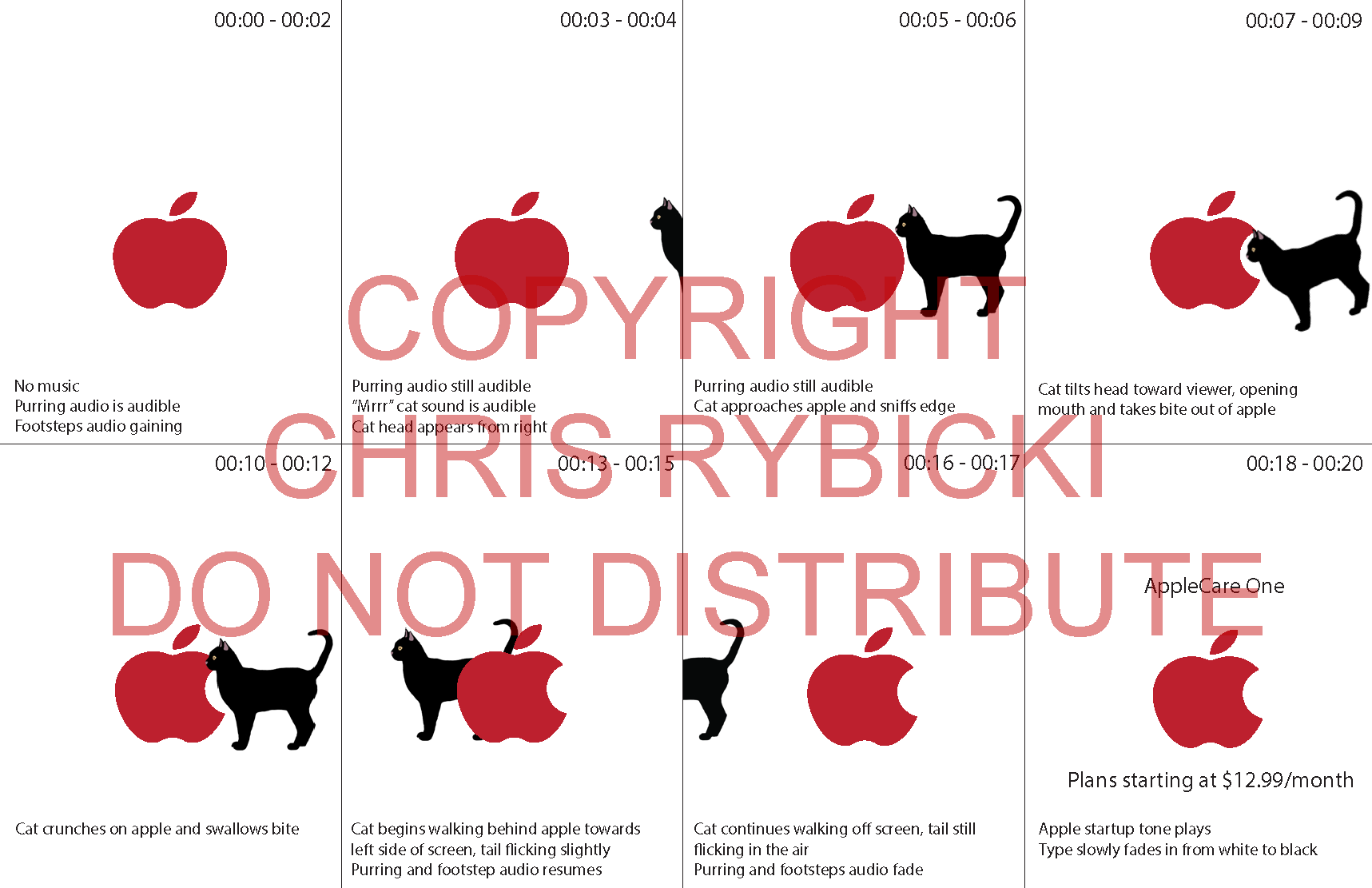
The commercial begins with a white background and a red apple. Purring is heard off screen. Suddenly, a black cat appears from the right side of the frame. It approaches the red apple and takes a sniff. Deciding it could be tasty, the cat takes a bite from the apple, leaving a crescent shaped hole. The cat then saunters off behind the apple, purring from enjoyment over its snack, and disappears off the left side of the frame. The Apple Mac startup chime plays and the text “Apple Care One” and “Plans starting at $12.99/month” appear above and below the apple.
When I started this project, I had drawn very bad sketches of a cat eating an apple. They were pretty embarrassing so I had to update them to a digital version instead.
I have yet to add the audio portions to this, but I look forward to returning to this animation and developing it further.
Creative Brief
Brand
Apple’s AppleCare One Subscription
Project Objective
This commercial introduces AppleCare One as an accessible, all-in-one protection plan for Apple device owners. The purpose is to drive awareness of the $12.99/month entry price point and encourage viewers to consider enrolling. The intended message is to show that accidents can happen from the most unexpected places.
Target Audience
Primary: Existing Apple device owners aged 18–40 who are aware of AppleCare but have not yet enrolled. They are likely deterred by unknown costs or complexity of purchasing.
Secondary: New Apple device purchasers at the point of sale or setup that are open to added protection but needing a simple, low-pressure nudge.
Key Message
AppleCare One gives you complete peace of mind for your Apple devices. Plans start at just $12.99/month. Simple, affordable, and covered by Apple.
Tone
The tone is minimal, quiet and charming. It’s true to Apple's visual language: lots of white space, no clutter, and no hard sell. The humor is subtle and invokes a surprised smile rather than a laugh.
Call to Action
"AppleCare One. Plans starting at $12.99/month." Is delivered as on-screen text only, no voiceover. It directs viewers to explore plans on Apple.com or through their device settings.
Visual Inspiration
The message aligns with Apple's signature white-space environment. The only elements on screen are the red Apple logo and a black cat. both flat, graphic, and iconic. The aesthetic echoes Apple's classic minimalist advertising. The red apple (post-bite) a matches the AppleCare logo currently in use.
Motion is slow and deliberate. The cat moves with the quiet confidence of a creature that owns every room it enters. Sound design does the heavy lifting; purring, soft footsteps, a curious "mrrr," the crunch of an apple, and finally the unmistakable Apple startup chime. Music is absent entirely until the end tone, letting the silence and animal sounds create the suspense and drama.
The logo bite by the cat is the selling point and the payoff. It's unexpected, memorable, and visually ties the concept together without needing a single word of explanation.
Formula 1 Logo Reveal Spot
For this assignment, I needed to create a 3 second motion graphic for a brand. I was actually watching a Formula 1 race when I was trying to come up with inspiration for this project.
I quickly brainstormed how to capture the attention of an audience in just 3 seconds.
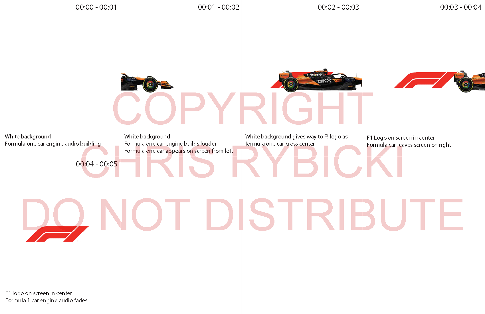
Beginning with a white background, the iconic Formula 1 engine audio fades in, growing louder. Suddenly a McLaren F1 car crosses the screen, revealing the F1 logo. Bringing up the rear, in it’s natural habitat, is the Ferrari F1 car. The audio is perfectly timed with each car as they race across the screen.
The intention for this short clip is to add it at the beginning or end of a longer form commercial. It could also be added as a transition animation when switching between broadcasts on live TV.
This was one of my favorite animations because it is complex for such a short animation.
The animation needed multiple layers to work. I added audio, imported graphics, a motion blur, and a track matte.
Creative Brief
Brand
Formula 1
Project Objective
This commercial serves as a short brand identity spot for Formula 1. The purpose is to reinforce the F1 brand through a visually striking logo reveal tied to the speed and energy of the sport. The goal is pure brand awareness and excitement.
Target Audience
Primary: Existing F1 fans who follow the sport casually or closely and respond to high-energy, visually dynamic content.
Secondary: General sports and motorsport enthusiasts who may be unfamiliar with F1 but are drawn in by the visual spectacle.
Key Message
Speed is everything. The F1 brand doesn't need to explain itself. The message is achieved via speed and sound.
Tone
High energy, cinematic, and confident. The visuals and sound do all the work. The spot should feel like a pulse of adrenaline.
Call to Action
The F1 logo appears on screen as the sole closing element. No text beyond the logo itself. It directs no specific action. The brand is the message.
Visual Inspiration
A plain white background keeps the focus entirely on the two elements in frame: the F1 car and the red F1 logo. The car races horizontally across the screen at full speed, and as it passes over the center, the red logo is revealed beneath it, as if uncovered by the car's motion. The aesthetic is minimal and high-contrast. The boldness of the red logo against white gives the reveal a sharp, satisfying payoff. Only the car and the logo exist in this world.
Nintendo Switch
Nintendo has become an evil corporation but I still like their games and their history. For this assignment, I wanted to create a short a animation that could be used at the end of a longer form commercial.
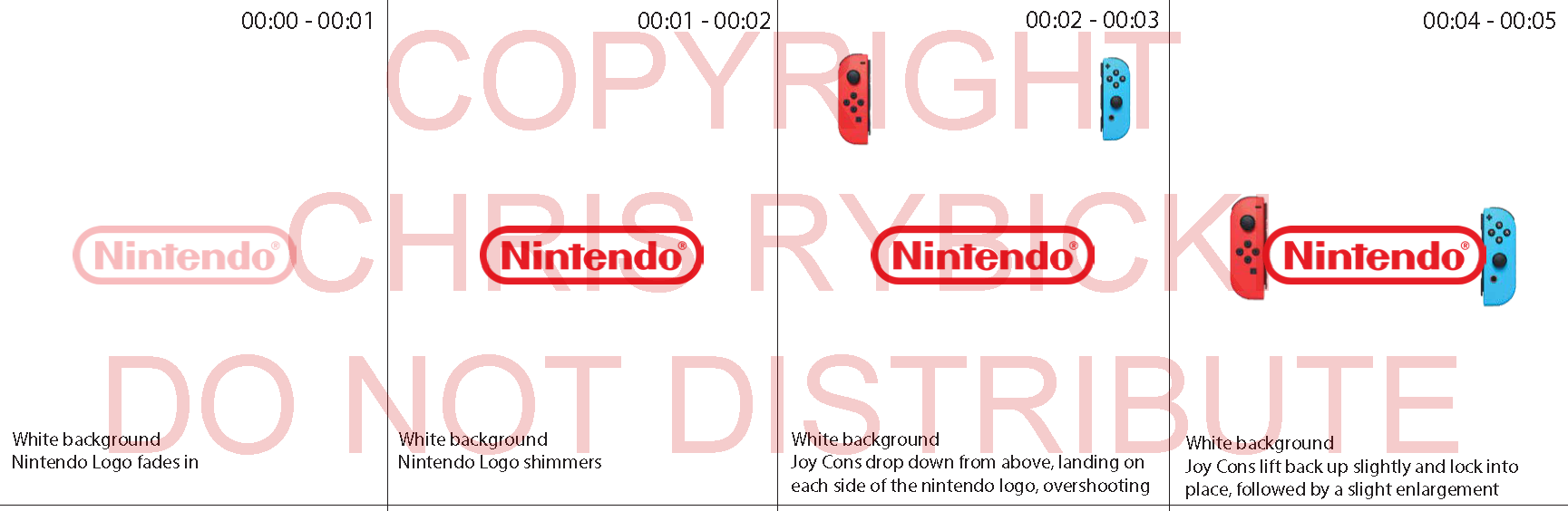
The Nintendo logo fades in from a white background, and a lens flare crosses horizontally. Suddenly the Switch Joy-Cons drop down, slightly passing the logo, then lifting back up and locking into place. The entire logo and Joy-Cons all enlarge slightly to confirm a successful connection.
This was a simple animation inspired by the Nintendo switch logo that uses the white Joy-Con motion graphic. I wanted to create something just a little bit different.
Eventually, I will develop this further into a more complex advertisement.
Creative Brief
Brand Nintendo
Project Objective
This animation is a short brand identity spot for Nintendo. The Nintendo logo fades in, a lens flare sweeps across it, and two Joy-Con controllers drop into frame from above, overshoot their resting position, and snap back up into place with a small bounce, resembling a dramatized version of a Joy-Con physically clicking onto a Switch console. The goal is pure brand recognition and a satisfying, tactile sense of motion tied to a signature piece of Nintendo hardware. This animation would be utilized as part of a larger commercial project, appearing at the beginning or end.
Target Audience
Primary: Existing Nintendo and gaming audiences familiar with the Joy-Con click-in motion and who respond to playful, tactile brand moments.
Secondary: General gaming or tech audiences who may not own a Switch but recognize the Nintendo brand and are drawn in by the snappy, satisfying motion.
Key Message
Nintendo is playful, precise, and instantly recognizable. The Joy-Con "click" motion reinforces a piece of brand-specific physical interaction the audience already knows, translated into a confident logo reveal.
Tone
Playful, snappy, and satisfying. The motion does all the storytelling. The story is built around a single dramatized gesture (the drop-overshoot-settle) that mirrors real Joy-Con behavior.
Call to Action
The Nintendo logo remains on screen as the closing element, flanked by the two settled Joy-Cons. No text beyond the logo itself; no specific action is directed. The brand and the gesture are the message.
Visual Inspiration
A plain white background keeps focus entirely on the logo, the lens flare, and the two Joy-Con shapes. The Nintendo logo fades in first; a lens flare (blended using a Screen blend mode) sweeps left to right across it. The left and right Joy-Cons then fall from above, dropping slightly past their final resting position on either side of the logo before pulling back up into place, growing subtly larger for a quick bounce as they settle. The aesthetic is minimal and high-contrast, letting the snap-into-place motion be the entire visual payoff.